- Undergraduate
- Research
- About the Program
- News & Events
- People
Back to Top Nav
Back to Top Nav
Back to Top Nav
Back to Top Nav
Spring 2023 was the first quarter in which Advanced Data Visualization (QSS 19) was offered in the Program in Quantitative Social Science. This course was taught by Professor Robert Cooper, who also regularly teaches the program's introductory course in data visualization (QSS 17). We talked with Professor Cooper after the course concluded, and he shared some of the projects that his students completed as part of the QSS 19 final.
"QSS 19, Advanced Data Visualization, pushes students to think in greater detail about what compels viewers to see, understand, and enjoy graphics created to summarize and present scientific findings, " according to Professor Cooper. "In the course, we first revisit all the key skills and code from Data Visualization (QSS 17) in fine detail, including data analysis via tidyverse, color theory, and plot customization, which adds a special layer of detailing that may include the use of functions in less intuitive and more creative ways. The plot types introduced in QSS 19 include waffle plots, stream plots, bump charts, and cartograms, to name a few. In addition, students in QSS 19 complete a deeper dive into animated and interactive plots, web scraping, and mapping. While QSS 19 students still work in the statistical environment R, the course connects R-based data analyses to web-based technologies like HTML and Javascript libraries like D3 in order to expand the possibilities of our visualizations. The course incorporates many student projects, which allows students to exercise their creativity and demonstrate their mastery of the code."
One project completed in QSS 19 this past spring is titled "A Day in the Life." According to Professor Cooper, "In this linked example, QSS 19 student Olivia Giandrea `23 created an interactive, animated bee swarm plot on a sample of the American Time Use Survey Data. Each point in the swarm plot represents a survey respondent and a respondent's answers to questions about how they spend their time spent during an average day. Survey responses include both the part of the day and the amount of time spent on certain activities (e.g., Respondent #678 reports typically exercising between 9:00 AM and 11:00 AM). Olivia chose a stark black-and-white color scheme with one respondent highlighted in red. Viewers of her this visualization can choose any respondent and follow this person them through their daily activities. The viewer may also choose a slower or faster version of the animation that Olivia created."
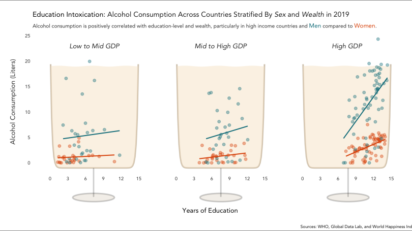
In a second project, pictured above, QSS student Ava Scharfstein `23 takes a closer look at the relationships between education, income, sex, and alcohol consumption. Ava uses subgroup regression to show how men and women demonstrate significantly different levels of alcohol consumption at higher levels of education and wealth, cleverly framing each education group with a chalice-like glass underneath."